
Card Deck Design - Roadmap to Inner Wellbeing
In our current lives, stress, deadlines, and constant demands can overwhelm us. The nervous system, our body’s internal communication network, plays a crucial role in how we react to these stressors.
I’m passionate about mental health & wellbeing and wanted to find out more about the nervous system. I discovered different states of disregulation affecting our body and how to reduce anxiety and increase resilience.
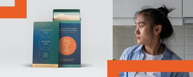
There’s a really great book out there to help with this fascinating topic and the journey to inner peace. ‘Anchored’ by Deb Dana provides valuable insights and practical exercises to understand and regulate your nervous system’s responses also called Polyvagal Theory.
“When we feel as if we need to power through an experience or that we need to suffer to see results, we stress the system and move into one of the survival states.”
Deb Dana "Anchored"
Brief
Her book contains a variety of easy exercises under different themes. This inspired me to create a card deck design to supplement this book as a practical and visual tool. As with many things, taking the time to practice regularly is where the benefits happen. This card deck design could help to access them straight away on a daily basis and mix and match them in a playful way.
As this is a passion project and not a real client project where original graphic assets would be available, I took the liberty to create a new set of colours but kept design elements e.g. the tree symbol from the book cover in mind.
Moodboard
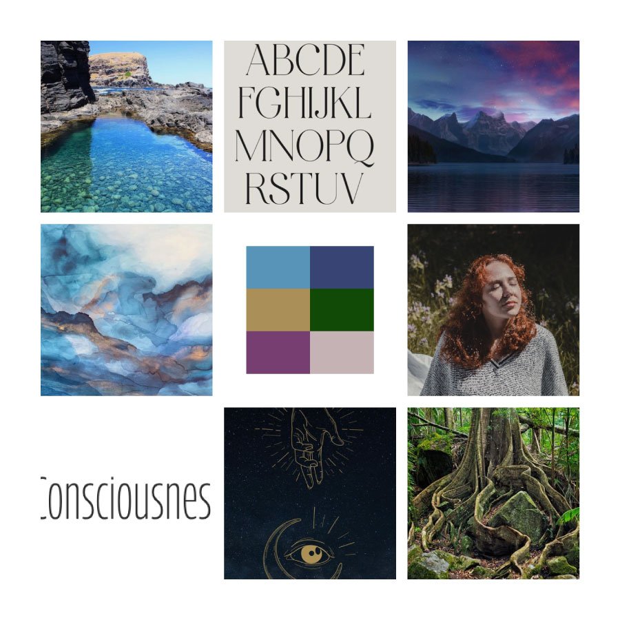
A short Moodboard reel/shorts
can be found here.
Design Direction
- Dark to light by exploring your inner self, shadows and shades of elements
- Tree as a symbol of the nervous system, roots as pathways
- Natural landscapes as cover design
- Textured landscape to highlight the different emotional layers
- A playful and organic serif type face used for headers and as used in the book
- A modern sans serif font to pair the serif headers for easy legibility of short exercise instructions
- Outlined illustrations in an organic look, not too symmetrical to show the human side with all flaws
- Colour palette with warm and muted tones for a natural and organic feel
Design Decisions
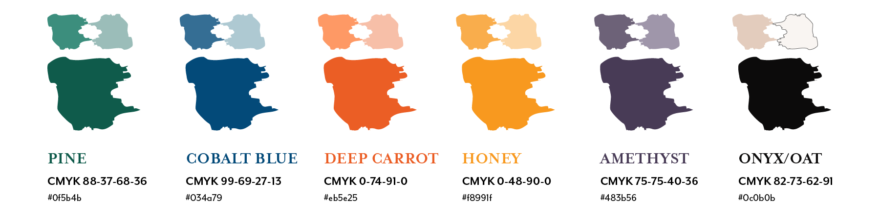
Colour Palette
Following on from the moodboard, the colour range has an organic feel with various shades and tones in blue, green, yellow and red. This is to show the human element and different ranges of emotions. I have chosen to brighten the colours a little bit to show a liveliness and electrifying opportunities to do these exercises. It felt more motivating than having a very muted colour palette. I also included a dark palette with blue and violet shades for a deeper side of the nervous system and topic in general. It’s not about being happy all the time but facing your darker aspects and working with these shadows.
Colour Interactions
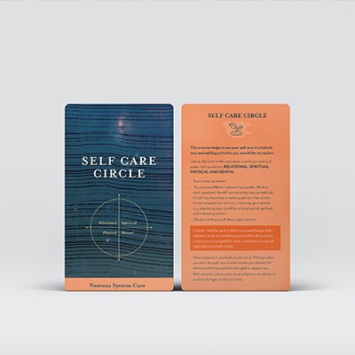
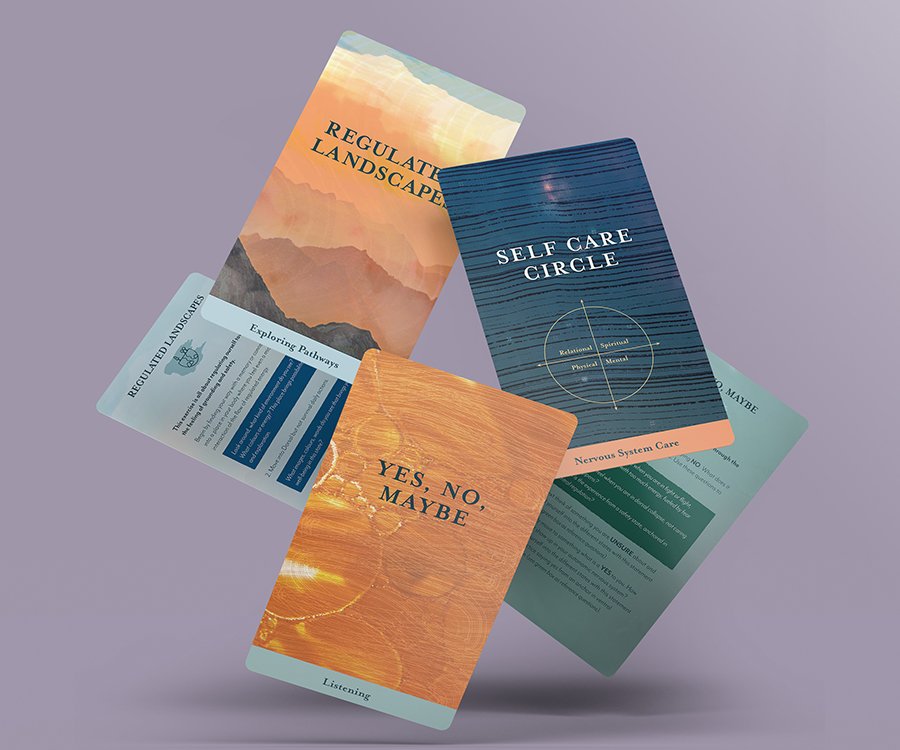
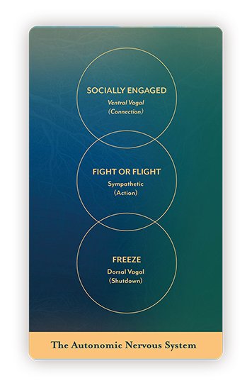
Using gradients as a layer on top of the images shows the different feelings, emotions and fluidity of the nervous system states. The exercise cards have a subtle gradient to build a harmonic and layered feel with the image underneath and texture above. Information cards have a gradient made up of dark blue and green to distinguish them from the exercise cards.
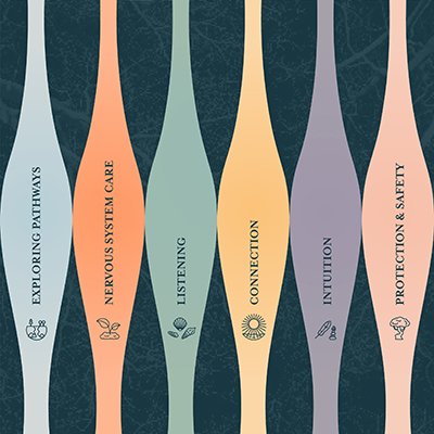
The colours also represent a category system. Each front of the card has a specific colour fitting to the category. The back of the card continues with the same colour. When the cards ultimately get shuffled or in any random order, it’s easy to look for the category finder at the back of the deck packaging.
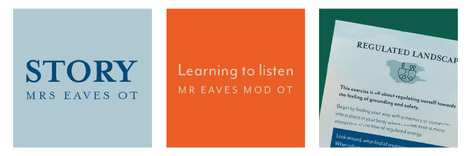
Typography
The book has a serif typeface all the way through. Due to the text considerably shortened, I chose a more organic, cosy and easier to read typeface. A sans serif font with an almost handwritten feel would complement the theme of inner self awareness.
Iconography
The text on the description side has been reduced as much as possible and is contrasted with brush edge boxes. In order to mix it up between just text and to give each category more personality, icons have been added. They consist of hand drawn nature icons as a symbol that we are all connected to nature.
Imagery and Textures
I retained the tree symbol as per the cover. Its tumbling roots resemble the pathways of the nervous system structure in our body. Continuing on this theme, I have chosen other natural elements e.g. the hexagon structure of a honeycomb, plants, water drops or a night sky with stars. The images have been deliberately textured or blurred by using a crystallising filter.
A wood textured brush effect on the top emphasises the organic feel. The image with the gradient as well as the brush texture create a raw and painted style look.