
Poster Design - Dribble, Shoot & Score
An international European basketball academy holds regular holiday camps for kids and teenagers. This is how I designed the marketing material in the form of three posters for a basketball camp.
Brief
The aim was to advertise in A3 poster format that an international basketball camp is running during the Christmas holidays.
This holiday camp is for boys and girls between 10 – 18 years. I was given camp details and access to ca. 300 images. Furthermore one brand font and colour, the company logo and sponsor logo.
The posters will be placed on walls in a gym.
Challenges
Including both tweens and teens.
The name Christmas Camp is related to a camp in January. It was therefore important to make aware of the actual date.
I went through the ca. 300 images to select relevant ones for the posters.
A3 poster size is a relatively small size to draw attention in the form of advertising. But it means working within budget constraints.
Research
Having received one brand colour acid green, I looked at their current website, previous posters and their Instagram to gauge the brand feeling.
The company offers a wide range of basketball training, games, and camps for kids and adults. Whilst basketball is a male dominated sport, I enquired about participation from girls after going through the many photos where I spotted some. I got confirmation that within the children category, they have a great number of girl players. I therefore wanted to make them more prominent on the posters.
As these posters had the goal to hang in the adjacent gym in the area, parents or older teenagers who frequent the gym were the target audience.
For the moodboard, I looked for basketball, sports and gym images as well as kids camp collages or flyers. I wanted to see how you can achieve a dynamic or sporty style with dynamic shapes, blocks, cuts, typography and contrast.
I wanted the design to still feel like it’s aimed at kids from 10 -18 as per the brief as opposed to adults. My aim was to keep the design clean so that people in the gym take in the most important parts when passing by the poster.
I then drew up a rough sketch of where which items, headings etc go.
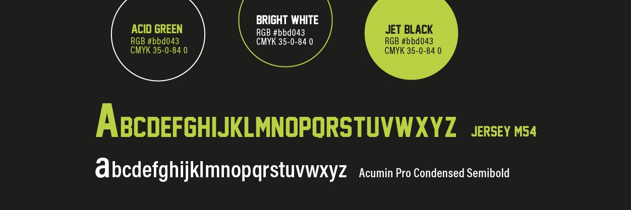
The colours I would use and ties in best with the brand were the given brand colour acid green and additionally black and white.
The file in Photoshop was set to CMYK for print.
Let’s see the results!
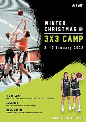
Poster 1
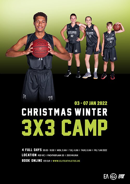
Designed by Lumimango – Christiane Holden
Using a black background for the majority of the poster set a good contrast for the details of the camp.
I used a large from image of a teenager who has a basketball in his hand. He holds the ball dynamically, almost enticing to throw it to you to start a game. I also wanted to show a range of age groups which I set further into the back.
The children are all accentuated by the green acid gradient. It’s almost like a winter haze.
The headline was placed in the middle to stand out. I used the same colour for the date to draw attention to the fact that the event with the given Christmas title actually takes place in the beginning of January.
I added Acumin Pro Condensed for small letters and punctuation such as dashes, dots, colons etc because the Jersey Main Font did not have these available. Having punctuation in the layout makes a clearer separation and easier to read.
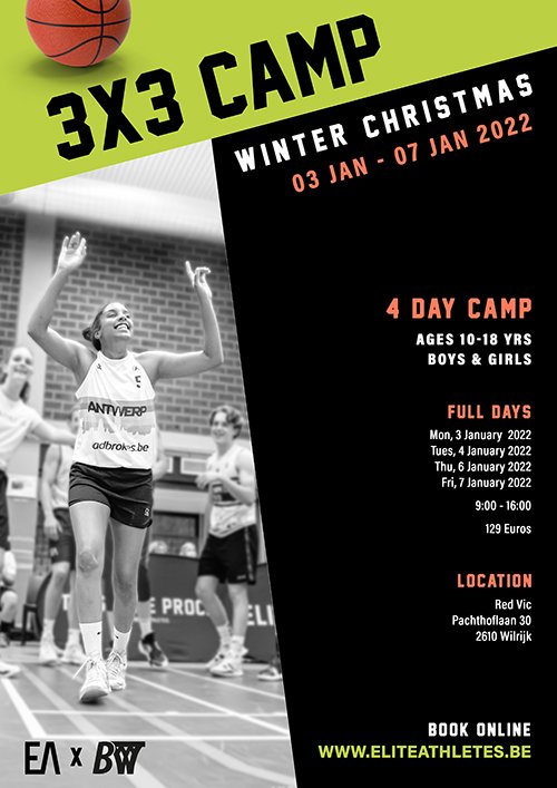
Poster 2
Designed by Lumimango – Christiane Holden
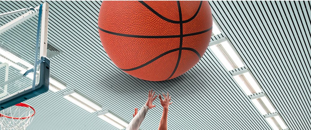
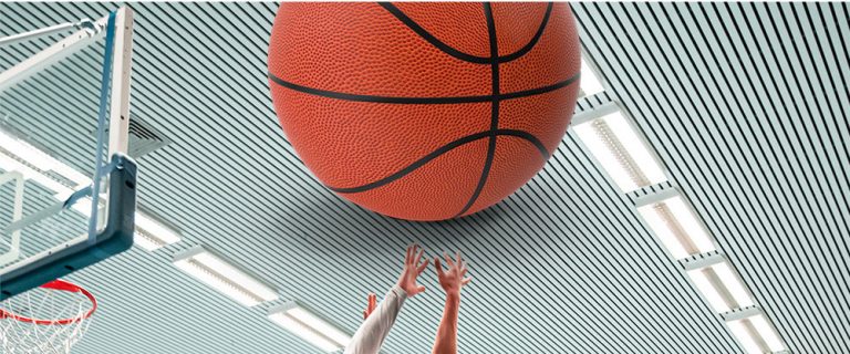
I went for a dynamic brush grunge look. I’ve chosen the left image to show the teenagers in action. The company shows lots of images in the basketball courts in their advertising. I wanted to draw on that feeling of when you’re jumping and trying to catch the ball and score. I changed the lighting of the photo to make it appear brighter as they battle it out. The eyes should then draw further right to the headline and subheadings on the black background. The basketball icon was added to balance out the width of the headline with the main header.
I included the girls on the bottom right for balance and added further details in a smaller typography.
I added the website for the booking in the detail section and on the bottom right in white with a shadow so it’s more legible against the green.
Poster 3
designed by Lumimango – Christiane Holden
For this variation, I’ve used different coloured blocks at a slanting angle to give it the dynamic feel.
I’ve chosen an image and changed it to black and white of a girls or mixed games where girl in the front is celebrating her victory. In order to get that feeling of happiness and achievement across, I added a subtle outer glow to the girl and blurred the background so that she stands out.
I’ve also put a basketball on the right so you would instantly grasp that it’s about playing basketball and a camp is happening.
I used the orange of the ball for subheadings to give it a christmassy/winter feeling. It also stands out with ‘4 day camp’ so that parents know it’s that many days. I added the age and gender range so that the viewer knows the camp is for everyone in a certain age group.
The camp details are right aligned with enough white space for an informed feel. It also gives a contrast to the slanted headlines.
If you are in need of brand design for your marketing materials, get in touch with me.