Logo Design: Long Name Logos
Short company names might have a snazzy sound and design advantage but there are also company names which are a bit longer.
The challenge is to get the design right, because we want to keep the logo clean and memorable.
Abbreviate
Long names can easily look there is too much going on.
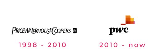
In the case of PricewaterhouseCoopers, a multinational business advisory company, they did a rebrand of their long and hard to read logo.
When I first heard of the company years back someone mentioned it as PWC, the abbreviated version.
Automatically, long names and even company departments are usually abbreviated after a while.
One tip is though, not all abbreviation work. They could mean something else in everyday life e.g. abbreviation DR. For most people ‘doctor’ comes to mind. It could also mean Democratic Republic or Digital Research but the company might be in a totally different industry.
Therefore, if the abbreviations fits the company’s industry purpose, it’s a good alternative.
Break it up
Splitting the name into two or three lines with a symbol on the side or on the top looks clean and gives good legibility.
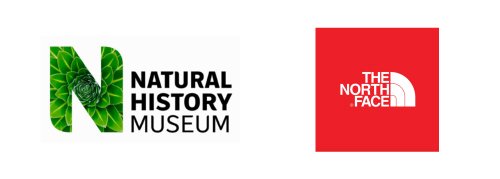
In the case of the National History Museum in London, UK, the big N in a green plant design fits beautifully with the company name on the right in three rows in a left centred direction.
Or let’s look at The North Face, an outdoor company where the name has been split into three lines again but right aligned next to the half dome lines symbol.
Different Colours
Using different colours makes is easier to visually distinguish names and grasp the company …
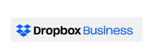
This example shows that Dropbox, the file storage and sharing company, also has a business division. You can clearly recognise Dropbox as the main … within the logo.
Condensed Typefaces
Sometimes, using a wide font contributes to further stretching of the already long name. Using a condensed typeface instead can help to perceive the logo quicker.
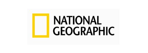
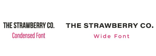
National Geographic, the monthly photojournalism magazine has a condensed font in their logo. I have also added my own example with ‘The Strawberry Co.” to illustrate the difference in using different font width.
Logo Options
If possible, a logo should have different variations to suit the different formats, where it is going to be used.
Using logo variations e.g. a horizontal lockup for the website or stacked for printed labels is a neat alternative.
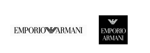
Here, the luxury fashion company Emporio Armani is using a horizontal logo lockup. The two words have been separated by the eagle symbol to break up the words.
Equally, the space distribution of the stacked version has its advantages on clothing and labels.
Break the Rules
Rules can be broken. It’s good to use guidelines and then experiment some more to see if the logo style fits within the brand.
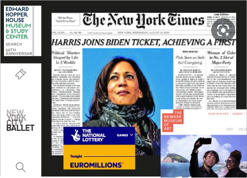
Lots of companies with long names actually don’t necessarily use a horizontal version but instead even go to the extreme of vertical stacking of 6 lines as on the website of the Edward Hopper House Museum & Study Center.
References
Logos: PriceWaterhouseCoopers, National History Museum, The North Face, Dropbox, National Geographic, Emporio Armani, Edward Hopper House Museum & Study Center, The New York Times, New York City Ballet, The National Lottery, The Newark Museum of Art
Disclaimer
Please note any direct links are affiliate programs with Amazon which means I get a small commission if you decide to purchase anything or sign up to services. You won’t pay a penny more but it helps me out!
If you want to a consultation about your logo design or branding, get in touch with me.

