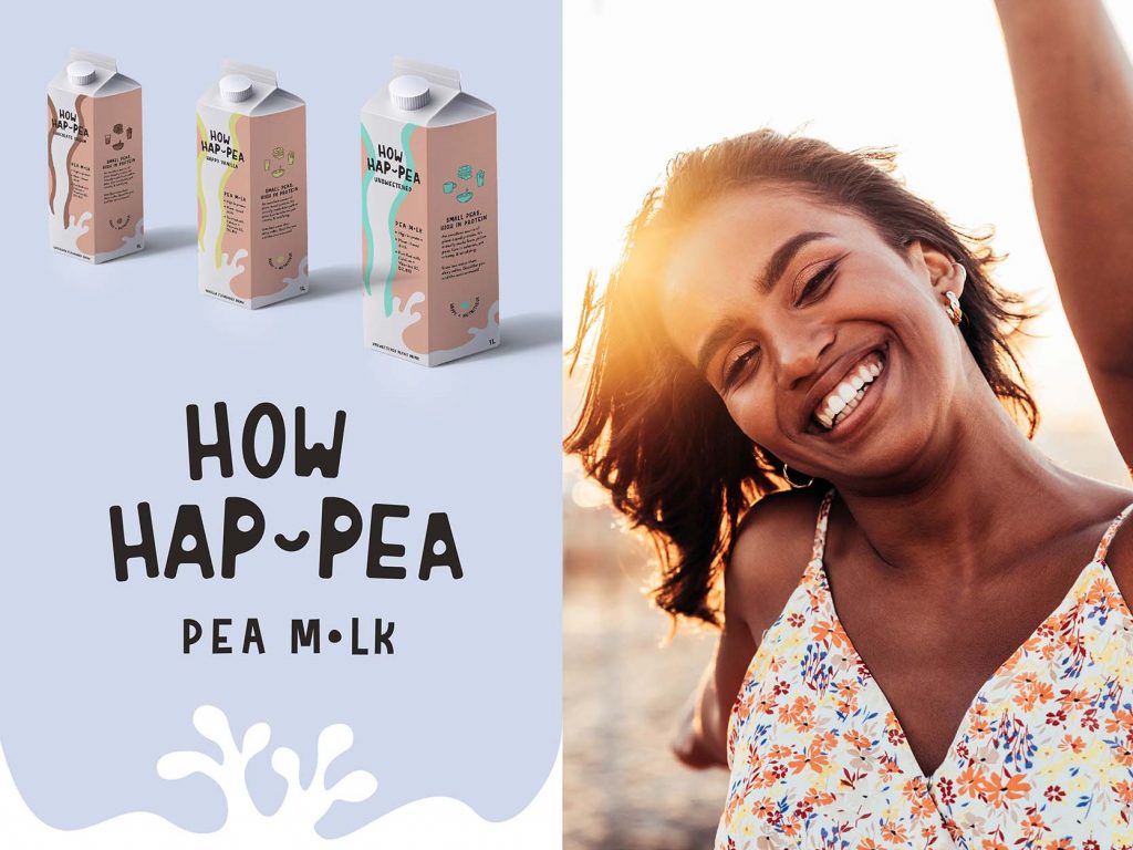
Creating a brand for plant based milk from scratch including
To position the brand as a new competitor in the plant based milk business. Create an awareness with customers that this brand has a higher sustainability factor and protein than some other brands. Additionally, inform customers in a fun way that pea milk is made out of yellow split peas and this flavour makes it very versatile for sweet & savoury dishes.
[ haʊ ˈhæpi ]
Part of the name as a requirement in the brief had already been given. It was ‘How Dairy’. Because it is a plant based non dairy milk I changed the name to ‘HOW HAP-PEA. This milk has yellow split peas as the main ingredient and is based on the word play ‘happy’.
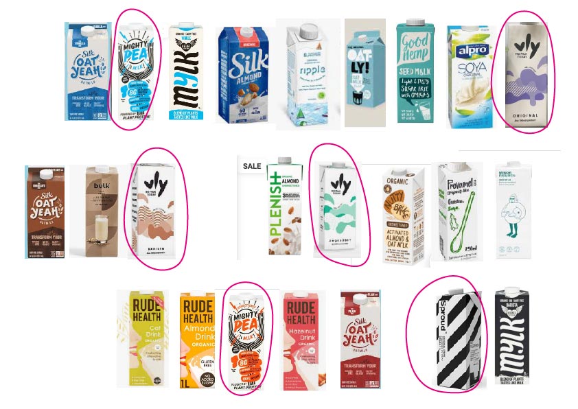
There are currently a lot of plant based milks available to purchase.
This list shows all kinds of plant based milks whereby the circled ones in pink are actual pea based milk drinks. I grouped them into colours and the majority has blue as a main colour. It is also apparant that white background is very popular. The majority of these milks also have an illustration or pattern on the packaging.
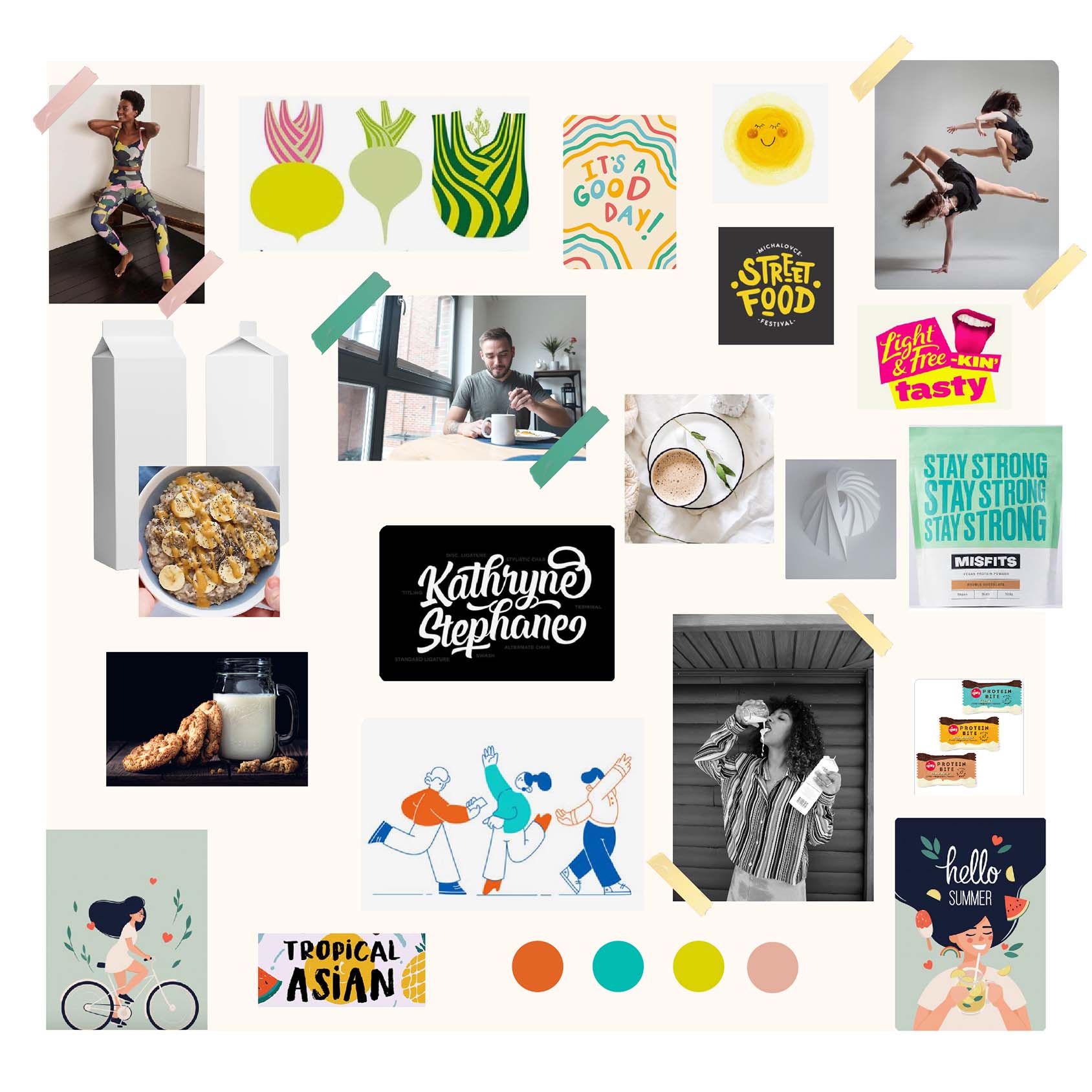
I decided to also show an illustration style for the packaging. Because the name ‘HOW HAP-PEA’ plays on the word happy, I leaned towards a playful mood, even in a dancey style. The typography for the logo is meant to come across in a happy or floaty style but also showing an organic food style character.
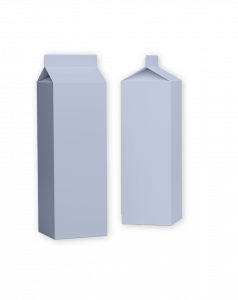
Contrary to the logo first, packaging later approach, the packaging dimensions & details of the packaging including the second side of the product called for a packaging first ideation.


The focal points of the packaging were:
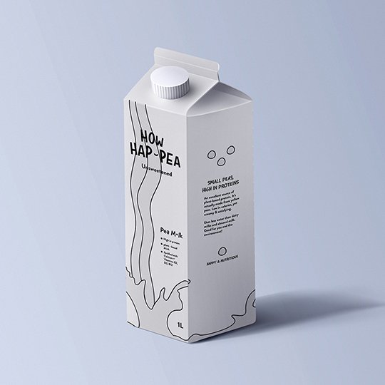
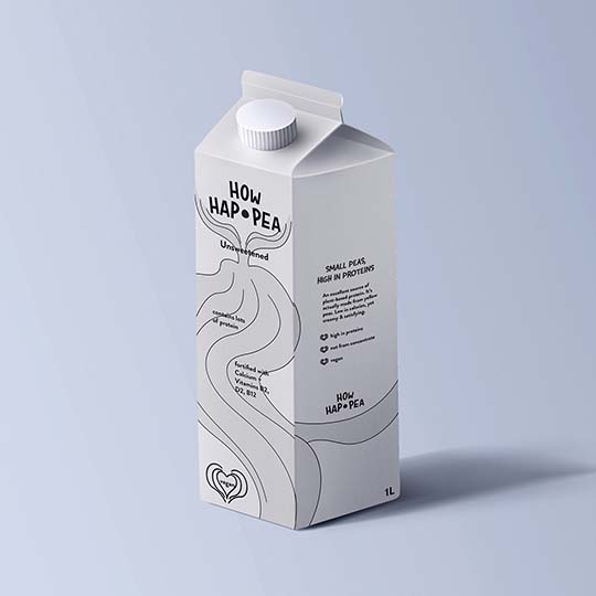
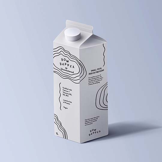
I did a test and put out the 3 packaging examples to gain people’s perception to which version they are attracted most as a potential consumer. The majority chose option A so that’s the version I enhanced and included brand colours.
Font used: ROCKINSODA REGULAR. Letters have been slightly increased especially the H and P and rotated marginally into different directions for a dancing or lively appearance.
The edges have been rounded. The space in the P and A have been rounded out to represent a pea shape.
The hyphen has been moulded into a smile to break up the words and suggesting that it is pea milk. The smiley hyphen surrounded by the peas can be interpreted as a little happy face.
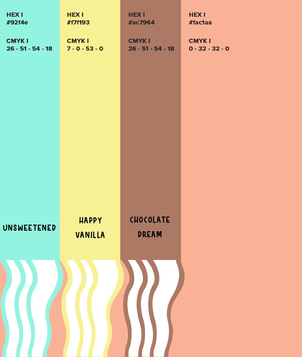
The colours from the moodboard felt a bit too muted to create a happy feeling. This pea milk is made from yellow split peas and the milk has an off white colour similar to oat milk. I wanted the packaging not be too earthy with muted tones and therefore slightly adjusted the moodboard colour to brighter shades.
Contact me to visualise your branding.
To provide the best experiences, we use technologies like cookies to store and/or access device information. Consenting to these technologies will allow us to process data such as browsing behaviour or unique IDs on this site. Not consenting or withdrawing consent, may adversely affect certain features and functions.
You are under 16 years old? Then you cannot consent to optional services. Ask your parents or legal guardians to agree to these services with you.
By accepting all services, you allow YouTube2,D (Functional, Data processing in unsafe third countries), Google reCAPTCHA2,D (Functional, Data processing in unsafe third countries), Google Analytics3 (Statistics), Elementor (Hosting this website), Google Tag Manager (Marketing), Pinterest Tag (Statistics), Pixel Your Site (Statistics) to be loaded.
For more information on the use of your data, please visit our privacy policy.