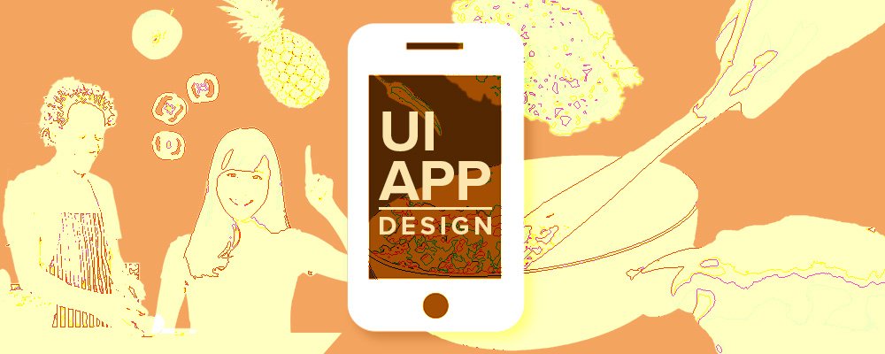

UI/UX Design - Recipe App
It is well known that cooking mostly from scratch at home is better for your health and wallet than dining out.
Even if you have beautiful physical cookbooks, how often do you make a recipe from them?*
Realistically, when you are tired after a long day, it’s unlikely you are investing the time into leafing through these books to get inspired and then actually cook anything. Not to mention whether the ingredients are actually to hand.
Whilst there are plenty of companies who deliver recipe kits with ingredients to your door, not everybody wants to pay for this convenience.
Brief
Create an app interface as a logged in user for a company called Dishes & Limes. This app gives you a selection of world cuisine recipes and is categorised into different diets. You can find a suitable recipe from the app’s extensive collection of recipes.
The app should have a shopping list feature and calculate the ingredients and/or quantities together for a clear overview which ingredients to shop for in the supermarket or when ordering online.
Characteristics of the app
- Every user whether using the app for free or paid, signs in once after downloading from the Google Play or App Store.
- Paywall for profitability: scanning of 5 recipes for free, subscription member receive a number of new recipes each week.
- The app assumes and notifies after registering that household items such as pepper, salt and oil are cupboard staples and are excluded from the shopping list.
Primary App Goals • Be inspired to cook more meals from scratch at home • Easy selection of diets and categories • Intuitive shopping list • Fresh & vibrant appearance in minimal design style
Secondary app goals
Time indicator to let people know how long it takes.
Scanning function of printed and online recipes.
The app could be connected to food retailers through issuing vouchers or ordering directly from your shopping list online with the designated retailer.
>>> In this task I’ve focussed on the Primary goals.
User Research
Cooking can be therapeutic. There was an increase of cooking at home during Covid-19 and sourdoughs became a thing.**
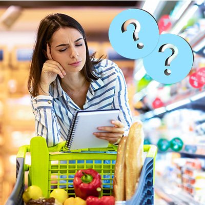
It is still a challenge now however finding yourself in the supermarket or when doing your online shop to think about what to cook unless you’re super organised and dedicated time to plan out the whole week.
The easier option would be to buy ready made meals. We all love convenience food, but one of the simplest ways to improve your health is by preparing more home-cooked meals. This way you can save on plastic waste too.
If you look up a recipe online, usually you have to scroll past a lot of adverts and images to get to the ingredients and method. Often you lose interest or you’re asking yourself what’s cups in ml again?
Recipe apps are very convenient. Digitising recipes onto an app make is so much easier to have them in one place. You can scan recipes from your physical cookbooks, blog recipes or shared recipes. No more writing down a recipe on a piece of scrap paper and loosing it to the paper abyss.
Whether free or paid, recipes apps are growing in popularity. The recipe apps market size was valued at USD 342.10 Million in 2020 and is projected to reach USD 1,098.22 Million by 2028 (Reference).
Competitors
There’s a big variety of Android and iOS recipe apps on the market. Popular ones are for example Whisk, Cooklist, Pepper or Kitchenstories. In some of them you can choose between metric (important for me) and other measurements. In some you can scan recipes, add ingredients together, save recipes and on one you could share recipes via WhatsApp or email and communities where everyone can put in recipes for the community to discover and cook.
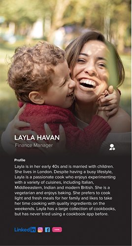
User Profile
There is a broad spectrum of users- from undergraduate to graduates, professionals basically anyone with a general enthusiasm to cook meals at home from scratch with quick recipes during the week and more elaborate ones on the weekend or during their time off.
For this task, the user profile is kept more brief. The ideal customer is a woman named Layla. It includes her demographics, lifestyle and that she has not tried a recipe app yet.
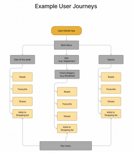
Example of User Profile and possible User Journeys for any user
Moodboard
It shows the look and feel as well as useful user interface (UI) elements. A moodboard shows the direction of the functionality and design. It acts as inspiration.
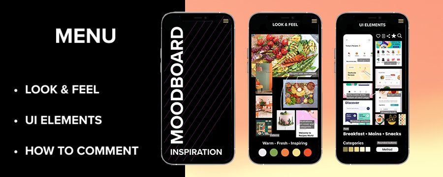
Moodboard shown as mobile view.
Sketching & Wireframing
After sketching solutions on paper, I transcribed them digitally into wireframes which are less focussed on the design but first focussed on the functionality.
My thoughts on the app:
- In order to have a clear overview of different diets and categories such as breakfast, mains etc. I experimented with blocks of information on one screen only or 2 flows to reach a category.
- Get quickly to recipes e.g. through a search function by using a sticky search menu at the bottom
- There is a function button bar which allows you to either view separately the ingredients, the method or make notes to avoid unnecessary scrolling.
- To favourite meals through a heart icon and access them at the sticky bottom menu and in the top menu for instant access
- Add ingredients to shopping list, sum up any of the same and sort them into food classifications. I included an option of taking off ingredients not needed on shopping list and a share function of the shopping list via icon on sticky menu
- Inspiration through weekly suggested feed in main screen.
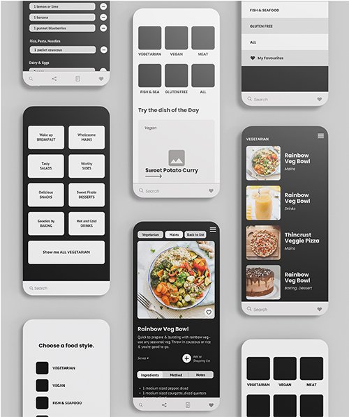
Wireframes which were then prototyped to show the functionality of the app
I then tested them on my own mobile to view the functionality in real life and adjusted layout and e.g. font sizes. If the app would be a real project, I would also include A/B user testing to see what resonates better with users.
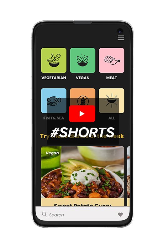
High Fidelity Design
In order to design the high fidelity version of the app flow, I created a design system in Figma. This means font or style choices can be easily altered in the design file.
In this example, I selected a dark mode interface. I have seen on another app that the user can make a choice using light or dark mode in the app.
Click here for a short demonstration of the app design.
Interesting articles to read and watch:
* What’s the point of cookbooks? https://www.theguardian.com/food/2022/nov/05/whats-the-point-of-cookbooks-hope-love-and-beauty-but-not-cooking
** https://now.tufts.edu/2021/01/26/sourdough-science-behind-pandemic-staple
YouTube – Delicious vegan food vloggers: Gaz Oakley, Pick up Limes (the name has nothing to do with this app)
If I can help with your web design get in touch with me.
Disclaimer for product placement
Please note any direct links are affiliate programs with Amazon or Redbubble which means I get a small commission if you decide to purchase anything or sign up to services. You won’t pay a penny more but it helps me out!